With my internet finally back, is time to continue with the thirty logos challenge, though, from now on I won't be posting one everyday due time and my need to post things apart from logos, but I'll keep doing the challenge.
Hello!
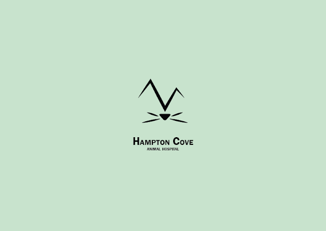
We're thrilled to see what amazing work you can do for the Hampton Cove Animal Hospital.
The Hampton Cove area is known for it's mountains, so we'd love to incorporate some mountain(s) in the logo somehow, maybe in the background. The main focus of course should be pets/veterinary/animal hospital.
If you look around the internet you can find a lot of great examples of animal hospital logos and we'd love something similar to them with the uniqueness of using mountains to represent the area we're located in! Thanks!
Ashley Stafford
Hampton Cove Animal Hospital
Onto the details!
- I didn't want to use a cupcake or cake, so I googled pattiseries and lord, am I hungry.
- Settled for a cupcake anyway because is more identificable than other baked goodies.
- Pastel blue because Patton, that's a given.
- The original idea was to use the cupcake to separate the word, but using different fonts seemed more natural.
- Not so easy to spot, but the letter T has a gradient.
- Once put together, the fonts made me think of the shows Bewitched and I Dream of Jeannie, they both have animated intros, so I just went ahead and made everything else cartoon-like.
- The things where the cupcakes are were originally intended to be iron thingies (how are they called?) but I really wanted to try my hand on a mock-up and, of course, there's no way to have something exact, so they're drawn in this one.
Here's challenge #18, I can't believe I'm past the first half, and this logo? It came to me super smoothly, it feels great!
Hey!
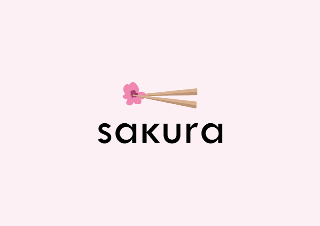
I own a sushi bar in downtown Los Angelas and looking for a fresh logo!
The name of my shop is called Sakura. This means flowering cherry (blossom) tree, so I'd actually be cool with using a cherry blossom, but please don't feel that you need to use this, just an idea!
I am definitely open to any other kind of sushi iconography. I do require that the name Sakura is included in the logo. Thanks!
Kyle Dawson
Sakura
Fast’s logo wasn’t that fast to make, but here it is!
Hello!
We're very excited to be working with you on the Fast branding!
Fast is an online form generator where users can generate and interact with any kind of form like W9, contracts, etc. It's perfect for freelancers and home business.
We'd like the word Fast to be the logo, with perhaps an icon that represents paper or a form. We also require it to be either blue or orange.
Thanks so much!
Felix Powell
Fast
Day 16! Butcher knives scare me so much, but that was the most fitting for this.
Hi there,
Sharp has been creating high quality cooking knives for over a decade. We're known for our craftsmanship, quality, and outstanding cuts.
We provide a variety of knives from chef to bread, and we need a new logo to represent our quality. We'd like our logo to be black and white, no colors please. We like logos that focus on minimalism and feature very subtle details.
Thanks so much!
Kevin Robinson
Sharp
Remember how I got challenge 2 first? Yesterday I got the mail with challenge 1, is really weird, but I'm not opposing to have all the prompts.
Hey Designer!
I'm Mary, the project coordinator at Space. We're so happy to have you work on our logo design! Space is building coworking offices so that freelancers and small startup companies have a stunning office to work out of without paying the big bucks to buy or lease a large building.
We offer rentable offices for teams of 1 to 12 in beautiful areas across the world including Austin, New York City, Raleigh, Chicago, San Francisco, and London. These offices are also great for people working remote for larger companies.
For the Space logo, we want to capture the idea of a personal, modern, and fun shared office space. We would be open to some kind of icon or using the text "Space" to represent the company. We don't have any requirements in terms of colors, text, icon, or otherwise. Have fun with some ideas!
And if this helps, some of our competitors are Industrious and WeWork.
Regards,
Mary Anderson
Space - Project Coordinator
For this I stuck with the idea of people being able to work remote, so the dot "jumping" from the S is to represent the easy exchange of ideas, but also alluding to Earth's atmosphere, as in "your workspace is the whole world".
I finally got around to do this logo, nothing convinced me until I remembered I should think about logos as icons, not illustrations.
Hey there,
We are so excited that you're taking on our rebrand! JJ Pizza has been serving the Chicago area with the very best pizza since 2002. We're rated #1 for the area and now it's time to step up our game!
I've attached our current logo (please don't laugh!). It was created when we first started but there is nothing unique about it. It's just something I put together a LONG time ago and it's time for something fresh.
I want to our exact red color as the main color whether it's a red logo or a white logo on a red background. Reason for this is because a lot of this red is painted on our walls, our cups, etc. and if we can keep that red, we can save some money.
The red color required is this hex code: #DF4337
That's the only requirement I can think of. You can try a pizza icon, the letters, whatever you want! Looking forward to seeing what you can do!
Josh Jackson
JJ Pizza
Today's logo was super funbecause I got to look at pictures of puppies!!
Hello!
Pups is a new online subscription service focused on dog food, toys, and medicine delivery. Our users sign up for weekly or monthly delivery of premium dog food straight to their door!
While a large bulk of our subscribers are for dog food, we also deliver toys, treats, and medicine. We don't want our logo to be focused around dog food but more around dogs/puppies!
For the Pups logo, we require the text "pups" as well as either a separate or integrated icon of a puppy or dog(s). We're so excited to see what you come up with!
Leah Duncan
Pups
I ended up skipping challenge 13 because I got frustrated, I'll go back to it when I catch up with the logos I have pending.
Good morning,
Thanks for taking the time to chat.
BookWorm™ is a growing online bookstore and we're looking to get a logo designed. I'm not really good at this kind of stuff so I don't know how much help I can be. We just want to see what you can come up with.
We're pretty much open to anything, whether it be using a worm or not. We do need the text BookWorm to be included of course. Thanks!!
Tyler Fitzgerald
BookWorm™
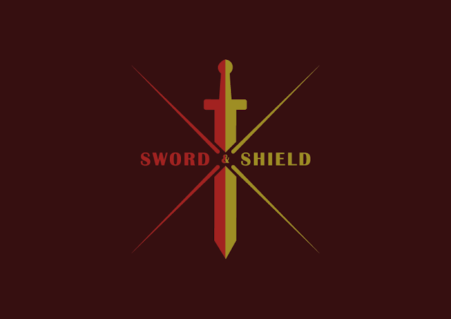
The only requirements for this were for it to work in both light and dark background and to have a sword and a shield, for that last one I went with an implied shield, a parted per saltire, to be more especific.
Hi!
Sword & Shield is an upcoming security system for tech companies. Our software includes password protection, server backups, malware protection, and more. We're focused on appealing to medium to large scale technology companies.
For our logo, we'd of course love to feature a sword and shield! Our team has discussed some ideas but we'd love to see what you come up with first.
We ask that the logo be provided in both a dark background and light background style. Thanks so much!
Lisa Harris
Sword & Shield
Blog Archive
- December 2018 (3)
- November 2018 (1)
- October 2018 (1)
- September 2018 (2)
- August 2018 (2)
- July 2018 (4)
- June 2018 (3)
- May 2018 (20)
- April 2018 (3)
- March 2018 (2)
- February 2018 (3)
- January 2018 (11)
- November 2017 (3)
- October 2017 (3)
- September 2017 (5)
- August 2017 (3)
- July 2017 (4)
- June 2017 (5)


