Cisne 2.0 | Redesign

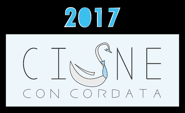
First image description: the words Cisne con corbata written with thin gray lines, instead of the letter S, theres a gray swan with a pale blue tie and beak. All of this is contained on a black rectangle with the legend 2017. End description

Second image description: a white swant with a bright blue necktie and black beak, besides it are the words Cisne con corbata in bold uppercase letters, the first word is written in blue while the other two are in black. All of this is contained on a black rectangle with the legend 2018. End description

Lately I went into an endless feeling of cringe whenever I saw my logo, I take it as a win because it means I have learned a lot in the past year, but I still needed to change it so, here you go: Cisne con corbata 2.0!
Brighter blue, more contrast, bolder letters and rounder edges, I'm pretty proud, but there's still hope I'll cringe about this new version next year, in the meantime, I'll be changing my icons during these days.

No comments:

Post a Comment

Leave a comment, it's free!